Challenge. We’ve observed that a specific group of our target audience is having difficulty locating our traditional newspaper and in-depth articles. The client has requested exploring ways to better assist readers in finding these resources and reinforcing one of their core propositions.
Value delivered. A validated concept for re-positioning and strengthening the digital version and proposition of our clients’ traditional newspapers, De Volkskrant, De Trouw, and Het Parool. Plus some extra features that solved low hanging fruit with high impact.
Background
Approach. We’ve conducted user interviews to gather insights, organized design sprints to develop concepts, and prototyped solutions to validate the concept. Based on the feedback collected, we made several iterations to establish a design with a solid foundation for future expansion.
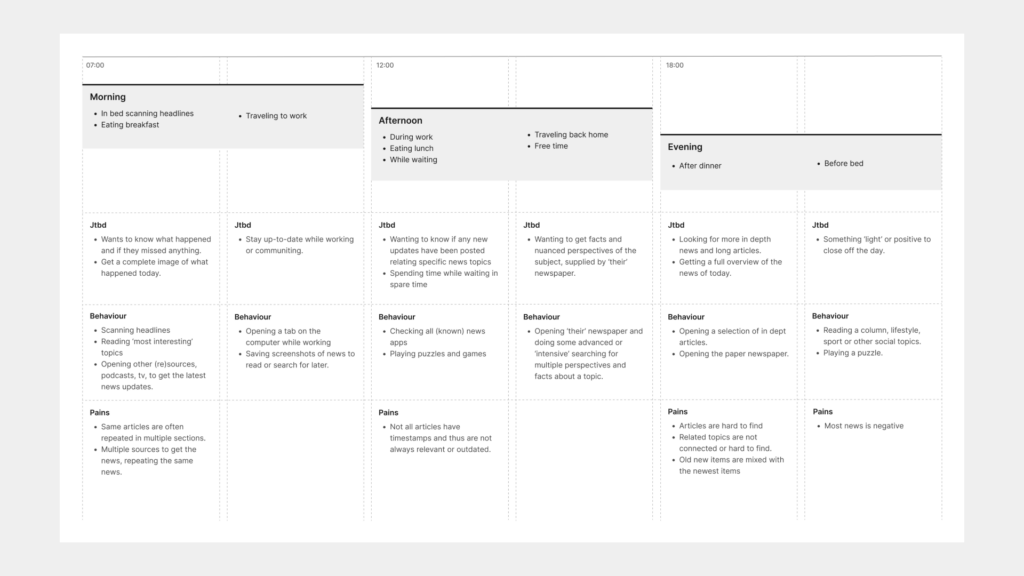
We created a customer journey based on user interviews, providing valuable insights into the needs, behaviors, and pain points of our target audience. We named this group “The Explorers” due to their behavior of seeking in-depth articles and scanning the traditional layout and sections of a newspaper until they have “finished” reading the day’s edition.
Solution
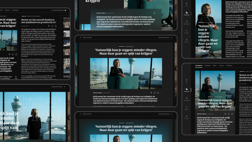
Concept Design. About 80% of users are on mobile devices, with a gradual shift towards tablets for reading the Edition on a larger screen. Therefore, we designed versions for both mobile and tablet. The mobile designs were initially developed by a small product team and later inspired a larger project and multiple design sprints to strengthen the Edition as a proposition.
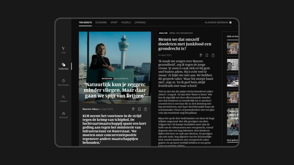
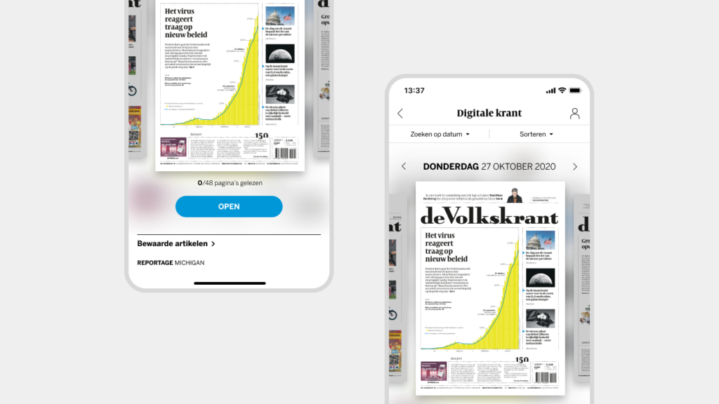
The mobile version emphasizes the digital cover, replicating the classic newspaper format. The tablet version introduces smaller digital “Collections” of articles, reflecting the classic newspaper sections, to help users access a curated bundle of in-depth articles for the day.

Extra Features
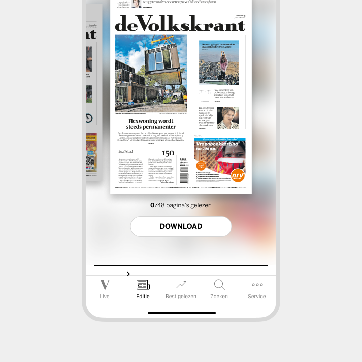
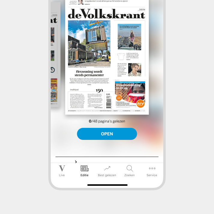
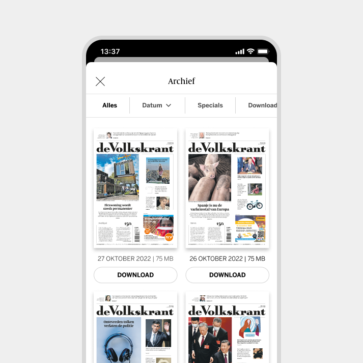
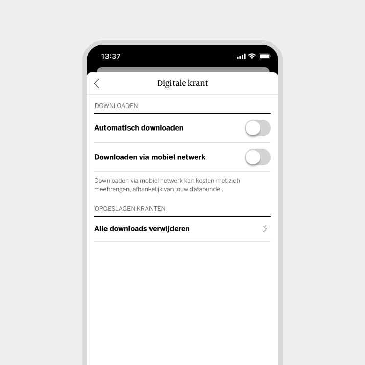
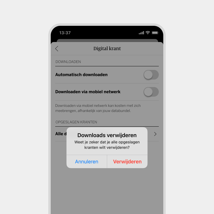
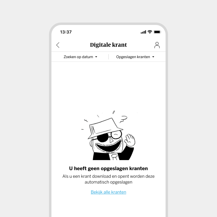
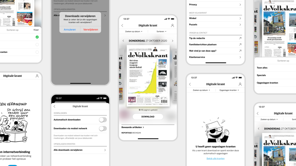
Offline availability. To help our users read their newspaper anytime, whether on holiday or while traveling, we developed a flow that allows them to store newspapers and manage their downloads.
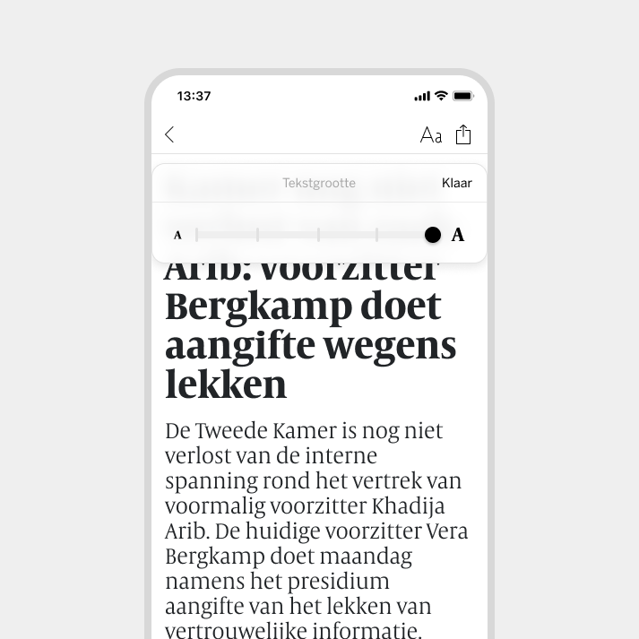
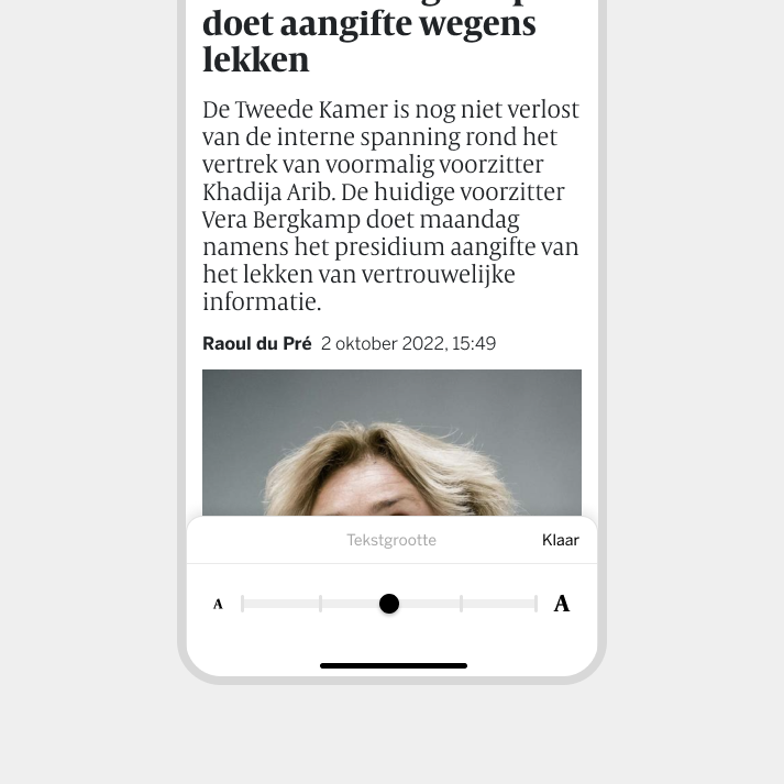
Accessibility. We also A/B tested the position of a potential text sizing feature to enhance the readability of articles.
